
Following on from the discussion of covers making an impact on the Beano thread, I thought it would be interesting to see what covers members feel fit that criteria on here, as suggested by Steve.
Rab has already mentioned 2000ad on that thread.
I have always thought that the early Pow! comics have good impact covers, although quite detailed they do grab your attention especially with the 'Howling Commandos' on the front, and the name draws you in as well.
Anybody agree, disagree? Anyone like to add more?
Impact covers

Re: Impact covers
Gosh! Sgt. Fury invented the Bruce Willis look before Bruce Willis did!
Of course, it's worth remembering that most of the Power Comics simply reprinted American covers (though, oddly enough, not in the case of your first example!). On the other hand, I do think there were times when the larger page-size gave them even more impact than the original.
- Phil R.
Of course, it's worth remembering that most of the Power Comics simply reprinted American covers (though, oddly enough, not in the case of your first example!). On the other hand, I do think there were times when the larger page-size gave them even more impact than the original.
- Phil R.
-
ISPYSHHHGUY

- Posts: 4275
- Joined: 14 Oct 2007, 13:05
- Location: BLITZVILLE, USA
Re: Impact covers
Great idea for another [offshoot] thread, for covers that fall outside the current 'Century's best' criteria, Matrix...
This is probably my favourite-ever single 2000 AD cover----ironically, it shares some similarity with the Dennis one, in that it's an extreme close-up shot:

Clearly, the image here is adapted from the comics version, and evidently someone else [whoever compiled this book] felt the same way as I did----until seeking out this image, I had no idea that it actually graces a cover of a book.
This almost photorealistic painting captures Dredd at his most grim and forboding, I thought.......I'm not even sure if it's a traditional or digital painting, : all I know is that this image hit me hard and I still love it.
This is probably my favourite-ever single 2000 AD cover----ironically, it shares some similarity with the Dennis one, in that it's an extreme close-up shot:
Clearly, the image here is adapted from the comics version, and evidently someone else [whoever compiled this book] felt the same way as I did----until seeking out this image, I had no idea that it actually graces a cover of a book.
This almost photorealistic painting captures Dredd at his most grim and forboding, I thought.......I'm not even sure if it's a traditional or digital painting, : all I know is that this image hit me hard and I still love it.
Last edited by ISPYSHHHGUY on 02 Mar 2013, 16:24, edited 1 time in total.


-
Lew Stringer
- Posts: 7041
- Joined: 01 Mar 2006, 00:59
- Contact:
Re: Impact covers
That Sgt.Fury image on Pow! No.13 is taken from the splash page of Sgt. Fury No.1. Perhaps Alf & Cos thought it had more impact than the actual cover.
Those Odhams comics are amongst my favourites, although back then covers were not designed with the idea of being noticed from across the room. (Especially as most were laid flat on the counter, with other comics/mags/papers overlapping them.) The main focus back then was on a strong logo, and Pow! certainly had that.
Those Odhams comics are amongst my favourites, although back then covers were not designed with the idea of being noticed from across the room. (Especially as most were laid flat on the counter, with other comics/mags/papers overlapping them.) The main focus back then was on a strong logo, and Pow! certainly had that.
The blog of British comics: http://lewstringer.blogspot.com
My website: http://www.lewstringer.com
Blog about my own work: http://lewstringercomics.blogspot.com/
My website: http://www.lewstringer.com
Blog about my own work: http://lewstringercomics.blogspot.com/
Re: Impact covers
I have to say that I agree with the 'gone but not forgotten' Kashgar that, during the 1960s, the closest British equivalent to the best American comic book covers appeared on DC Thomson's story papers such as Rover, Adventure and Wizard. Here's a particularly striking example from 1965 by the amazing John 'Ian' MacKay:

- Phil R.
- Phil R.
-
ISPYSHHHGUY
- Posts: 4275
- Joined: 14 Oct 2007, 13:05
- Location: BLITZVILLE, USA
Re: Impact covers
Those 1960s examples have great period pen-and-ink charm, although it makes some of us who were around at that time feel positively ancient!
Here's another personal 2000 AD 'fave rave pic' from 1991 [prog 730]---sorry I don't know the artist---the time-traveling story was so-so-----great artwork in the actual story, though.....

Here's another personal 2000 AD 'fave rave pic' from 1991 [prog 730]---sorry I don't know the artist---the time-traveling story was so-so-----great artwork in the actual story, though.....
-
colcool007

- Mr Valeera
- Posts: 3872
- Joined: 03 Mar 2006, 18:06
- Location: Lost in time, lost in space
- Contact:
Re: Impact covers
I must admit to enjoying all the one picture covers that we used to get. I loved Ron Smith's work in Hotspur and Ian Kennedy's in Warlord. Not forgetting Carlos Ezquerra's work in Battle. For impact, I think Battle used to edge the competition, but we mustn't forget the covers from Action. Now there was a comic with impact!
I started to say something sensible but my parents took over my brain!
-
stevezodiac

- Posts: 4957
- Joined: 23 May 2006, 20:43
- Location: space city
Re: Impact covers
Here are a couple that were close to hand:


Re: Impact covers
This is just to show that Thomsons had used the Rover and Wizard cover concept many years earlier. Having said that, I think the one Phil posted is considerably more dramatic.
- Attachments
-
Re: Impact covers
Those examples are very nice covers, definately printed to have an impact on regular and potential readers.
I guess it's also easy to only think of covers that have a strong macho theme targeting one audience, forgetting that younger reader comics, girl, and humour comics (not forgetting the Dennis cover), would also have their own impact covers.
In respect to girl covers I always thought that Diana comic tried very hard to do that each week. Every now and again a comic would change it's covers to suit maybe a social change (as the Hitler cover shows, the eyes!) girl comic included pop stars on the front in the sixties, the Cliff Richard cover from 1961 below being a good example.
- Attachments
-
-
Re: Impact covers
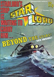
Starlord had some great covers, such as
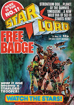

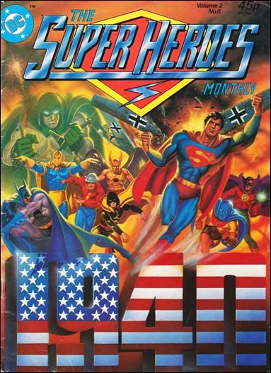
as did DC's foray into Seventies Britain:

as did DC's foray into Seventies Britain:
STARSCAPE Comic
http://facebook.com/Starscape-Comic-108831387707862/
comics, cartoons, music & movies
http://facebook.com/Starscape-Comic-108831387707862/
comics, cartoons, music & movies
-
Lew Stringer
- Posts: 7041
- Joined: 01 Mar 2006, 00:59
- Contact:
Re: Impact covers
I can't help feeling that most of those Pow / Starlord / Superheroes covers are preaching to the converted (ie: kids who already know the characters or who already buy comics).
They don't have the same power as that Beano Dennis cover which was a striking image to make anyone take notice, whether or not they already knew about The Beano. The reason that Beano cover worked was because it's such a basic image, but raises our curiosity; a tight close up of a mischievous face. The character, making direct eye contact with the viewer, looks like he knows something we don't. It's intriguing. For regular readers the attraction is the shock of it being so radically different. For new readers it's compelling them to find out just what this publication is.
Those StarLord and Superheroes covers used the techniques of comics to sell the product. That Beano cover used the design techniques of advertising. Different approach.
http://www.ppa.co.uk/ppa100/vote/#beano
Re: Impact covers
Not sure I can agree with that. What first brought people into many comics, I'd imagine, is a striking cover. It doesn't need a knowledge of the Spectre (or superhero comics) to be intrigued by that Superheroes cover. The painted cover isn't less appealing than the Dennis one, I would imagine.
In my opinion, everything Lew has said about the Beano cover is matched by the DC Superheroes covers. You see it and you think, wow, that's amazing. What's inside? (In fact, the DC monthly had some pretty terrible stories that were totally out of touch with the kids of the Seventies reading Mighty World of Marvel and Warlord). You read superhero comics and you think, wow, that's a stunning cover - better than most superhero comics.
In my opinion, everything Lew has said about the Beano cover is matched by the DC Superheroes covers. You see it and you think, wow, that's amazing. What's inside? (In fact, the DC monthly had some pretty terrible stories that were totally out of touch with the kids of the Seventies reading Mighty World of Marvel and Warlord). You read superhero comics and you think, wow, that's a stunning cover - better than most superhero comics.
STARSCAPE Comic
http://facebook.com/Starscape-Comic-108831387707862/
comics, cartoons, music & movies
http://facebook.com/Starscape-Comic-108831387707862/
comics, cartoons, music & movies
Re: Impact covers
I dont think anyone would dispute that the Beano example in the competition is not worthy of it's place, although personaly I am more drawn to the Beano logo myself, if I cover the logo up to me it does'nt have the same appeal.
In respect to most of the samples on here, surely all that artwork on the cover is there for a reason, after all the converted would need to stay converted, and I feel if they had gone to say an insignificant black and white cover would they sell as many comics?
In respect to most of the samples on here, surely all that artwork on the cover is there for a reason, after all the converted would need to stay converted, and I feel if they had gone to say an insignificant black and white cover would they sell as many comics?