
Shown here (rather bad quality - sorry) is an image of what is a colour proof/separation/sample (not sure what it is called) of the cover to the first issue of Monster Fun which interestingly shows a different date. Seems to depict three colours running: cyan, yellow and magenta with no black. Can anyone help with this regarding why it exists and its exact purpose etc? Any info would be much appreciated. Thanking you in advance.
Monster Fun first issue colour guide
Monster Fun first issue colour guide
Help!!  Does anybody in this group have knowledge of the printing process and especially colour sample sheets and printer's colour separations for British comics from the 1970s, as I have just purchased such a piece and would like some more information?
Shown here (rather bad quality - sorry) is an image of what is a colour proof/separation/sample (not sure what it is called) of the cover to the first issue of Monster Fun which interestingly shows a different date. Seems to depict three colours running: cyan, yellow and magenta with no black. Can anyone help with this regarding why it exists and its exact purpose etc? Any info would be much appreciated. Thanking you in advance.
Shown here (rather bad quality - sorry) is an image of what is a colour proof/separation/sample (not sure what it is called) of the cover to the first issue of Monster Fun which interestingly shows a different date. Seems to depict three colours running: cyan, yellow and magenta with no black. Can anyone help with this regarding why it exists and its exact purpose etc? Any info would be much appreciated. Thanking you in advance.
- Attachments
-
-
stevezodiac

- Posts: 4957
- Joined: 23 May 2006, 20:43
- Location: space city
Re: Monster Fun first issue colour guide
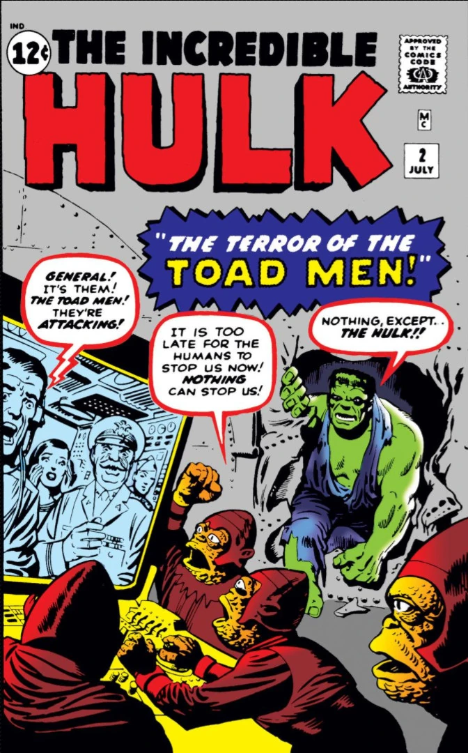
I presume it was sent to the printers to make sure they used the correct colours. The first issue of the Hulk in his own comic in the early 60s showed him as being grey rather than green because of a mix up at the printers, somebody please correct me if I'm wrong.
-
stevezodiac
- Posts: 4957
- Joined: 23 May 2006, 20:43
- Location: space city
Re: Monster Fun first issue colour guide
Found this on the net:
Originally, Stan Lee and Jack Kirby intended the Hulk to be gray. But the printing press kept having trouble with the Hulk's color and he kept coming out green. So he only spent the first few issues of his comic being gray.
Originally, Stan Lee and Jack Kirby intended the Hulk to be gray. But the printing press kept having trouble with the Hulk's color and he kept coming out green. So he only spent the first few issues of his comic being gray.

-
seanphillips

- Posts: 25
- Joined: 15 Apr 2013, 17:15
Re: Monster Fun first issue colour guide
That looks like a hand-painted blue line colour page. The black would have been on a clear acetate overlay, and when combined with the colour would have resulted in full-colour art with nice crisp black line work when printed.