
Comics with the most eye-catching name or logo
Re: Comics with the most eye-catching name or logo
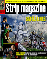
The least eye-catching has to be the dreadful Strip Magazine logo. How dull is this?
STARSCAPE Comic
http://facebook.com/Starscape-Comic-108831387707862/
comics, cartoons, music & movies
http://facebook.com/Starscape-Comic-108831387707862/
comics, cartoons, music & movies

Re: Comics with the most eye-catching name or logo
I loved the comic and thought it had great potential, I found the name "Strip Magazine" was very unimaginative. 
Reading comics since 1970. My Current Regulars are: 2000 AD (1977-), Judge Dredd Megazine (1990-), Spaceship Away (2003-), Commando (2013-), Monster Fun (2022-), Deadpool and Wolverine (2023-), Quantum (2023-).

Re: Comics with the most eye-catching name or logo
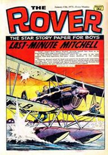
Others that were not eyecatching would be Sparky's original logo, and Rover's final one - as they were too similar to logos used by the Dandy and the Topper at the same time (1967 for Sparky and Dandy, 1973 for Topper and Rover).
Topper: http://static.comicvine.com/uploads/sca ... 601-01.jpg
Topper: http://static.comicvine.com/uploads/sca ... 601-01.jpg
Re: Comics with the most eye-catching name or logo
I must admit it seems pretty lazy of DCT to use the same font style for both The Topper and Rover. But it is not the last. Has anyone noticed the current font style used by Dennis and Gnasher is identical to revamped Dandy in 2004.
Buddy's nor Champ's names or logos didn't do much for me either.
Buddy's nor Champ's names or logos didn't do much for me either.
Reading comics since 1970. My Current Regulars are: 2000 AD (1977-), Judge Dredd Megazine (1990-), Spaceship Away (2003-), Commando (2013-), Monster Fun (2022-), Deadpool and Wolverine (2023-), Quantum (2023-).
-
Marionette

- Posts: 541
- Joined: 17 Aug 2012, 23:50
- Location: Lost in time and lost in space. And meaning.
Re: Comics with the most eye-catching name or logo
I think Spellbound was the most engaging title logo of any girls' comic, especially since it was almost always combined with an image that made it clear that the comic was dealing with the fantastic, rather than a more mundane interpretation. This stood out particularly well in a field dominated by titles that were simply girls' names, over bland, or at least unadventurous cover art. The blandest of all has to be the generic "Girl", particularly in its second incarnation, which simply used photographs for cover art, and aspired to an older age group's magazine style.Phoenix wrote:I think this Spellbound cover has a lot going for it, but as the logo seems to work best in conjunction with the rest of the design, separating the elements does take a little something away from the logo, although it's still impressive.
The Tammy Project: Documenting the classic British girls' comic, one serial at a time.
-
tony ingram

- Posts: 1169
- Joined: 12 May 2009, 18:20
- Location: Suffolk, England
- Contact:
Re: Comics with the most eye-catching name or logo
If you're talking Generic...Marionette wrote:The blandest of all has to be the generic "Girl", particularly in its second incarnation, which simply used photographs for cover art, and aspired to an older age group's magazine style.

-
colcool007

- Mr Valeera
- Posts: 3872
- Joined: 03 Mar 2006, 18:06
- Location: Lost in time, lost in space
- Contact:
Re: Comics with the most eye-catching name or logo
I've got to admit that I think that the most iconic of all is the original Eagle logo. And I think we would all be hard pressed to come up with one that is better than the simplicity of the soaring eagle with the three colours of black, yellow and red. And for any other to express as much as that masthead.
I started to say something sensible but my parents took over my brain!
-
Lew Stringer
- Posts: 7041
- Joined: 01 Mar 2006, 00:59
- Contact:
Re: Comics with the most eye-catching name or logo
Agreed. I think we have to consider every logo within the context of its times. Prior to Eagle, many traditional UK comics had very ornately designed mastheads (even cluttered in some respects) which were still really being inspired by the mindset of the 1930s or earlier. That bold, no-frills Eagle logo must have seemed so modern and dramatic in 1950.colcool007 wrote:I've got to admit that I think that the most iconic of all is the original Eagle logo. And I think we would all be hard pressed to come up with one that is better than the simplicity of the soaring eagle with the three colours of black, yellow and red. And for any other to express as much as that masthead.
As Dez Skinn has said elsewhere in the past, a good logo is one that stands out, with the name of the comic clearly legible, that customers will notice if they're standing several feet away in a shop. That original Eagle logo certainly lived up to that.
The blog of British comics: http://lewstringer.blogspot.com
My website: http://www.lewstringer.com
Blog about my own work: http://lewstringercomics.blogspot.com/
My website: http://www.lewstringer.com
Blog about my own work: http://lewstringercomics.blogspot.com/
Re: Comics with the most eye-catching name or logo
I would say that the current 2000AD is similar.Lew Stringer wrote:Agreed. I think we have to consider every logo within the context of its times. Prior to Eagle, many traditional UK comics had very ornately designed mastheads (even cluttered in some respects) which were still really being inspired by the mindset of the 1930s or earlier. That bold, no-frills Eagle logo must have seemed so modern and dramatic in 1950.colcool007 wrote:I've got to admit that I think that the most iconic of all is the original Eagle logo. And I think we would all be hard pressed to come up with one that is better than the simplicity of the soaring eagle with the three colours of black, yellow and red. And for any other to express as much as that masthead.
As Dez Skinn has said elsewhere in the past, a good logo is one that stands out, with the name of the comic clearly legible, that customers will notice if they're standing several feet away in a shop. That original Eagle logo certainly lived up to that.
Reading comics since 1970. My Current Regulars are: 2000 AD (1977-), Judge Dredd Megazine (1990-), Spaceship Away (2003-), Commando (2013-), Monster Fun (2022-), Deadpool and Wolverine (2023-), Quantum (2023-).
Re: Comics with the most eye-catching name or logo
At least Gnasher didn't start using it until 2009, which is two years after the Dandy ditched it. The Rover and Topper covers I linked to are from the exact same week!SID wrote:I must admit it seems pretty lazy of DCT to use the same font style for both The Topper and Rover. But it is not the last. Has anyone noticed the current font style used by Dennis and Gnasher is identical to revamped Dandy in 2004.
-
felneymike
- Fence Sitter
- Posts: 1901
- Joined: 30 Sep 2007, 15:03
- Location: Cambridgeshire
- Contact:
Re: Comics with the most eye-catching name or logo
Ooh, careful! a whole plot in a single issue, that'll never compile into a graphic novel!tony ingram wrote:If you're talking Generic...Marionette wrote:The blandest of all has to be the generic "Girl", particularly in its second incarnation, which simply used photographs for cover art, and aspired to an older age group's magazine style.
[img]Stop%20quoting%20images,%20dumbass![/img]
-
Lew Stringer
- Posts: 7041
- Joined: 01 Mar 2006, 00:59
- Contact:
Re: Comics with the most eye-catching name or logo
The Rover and Topper logos were hand lettered. It's not a font, just likely to be the same designer. It was a bit too jolly for The Rover though.Digifiend wrote:At least Gnasher didn't start using it until 2009, which is two years after the Dandy ditched it. The Rover and Topper covers I linked to are from the exact same week!SID wrote:I must admit it seems pretty lazy of DCT to use the same font style for both The Topper and Rover. But it is not the last. Has anyone noticed the current font style used by Dennis and Gnasher is identical to revamped Dandy in 2004.
The blog of British comics: http://lewstringer.blogspot.com
My website: http://www.lewstringer.com
Blog about my own work: http://lewstringercomics.blogspot.com/
My website: http://www.lewstringer.com
Blog about my own work: http://lewstringercomics.blogspot.com/